Beginning to analyze mRNA data
One of the first parts of my journey into bioinformatics with R was analyzing RNASeq and microarray data. One of the first things I needed to do is Principal Component Analysis (PCA) on all samples and all genes from an already-aligned RNASeq experiment, so I decided to put together a function that would analyze and visualize the data for me, regardless of how many samples are in the experiment. I also wanted to use a tidy data paradigm as much as possible, but it is true that for many bioinformatics applications tidy data is rather cumbersome. Thus, after many hours of trial and error, I decided that all tidy data behavior for my projects will be embedded in my functions but the data will remain in standard data frames and matrix formats outside of them. Let’s go!
The experiment
In my first experiment, I had to analyze the effects of a Dox-inducible shRNA system against the NLGN4X gene in the SUM159 cell line. There are two shRNAs, so that means I have 4 samples: 2 controls and 2 dox-activated shRNA samples, and RNASeq alignment was done for me
Importing and Processing Data
I may write a post another day on how alignment works and how to imported the aligned counts, but for now that’s already been done. We need two kinds of data frames. One of them has genes as rows and samples as columns. I named it countsData and it looks like this:
tibble::as_data_frame(countsData)
## # A tibble: 18,257 x 4
##    SUM159.shNLGN4X.1… SUM159.shNLGN4X.… SUM159.shNLGN4X.… SUM159.shNLGN4X…
##  *              <int>             <int>             <int>            <int>
##  1                335               330               390              580
##  2                105                65                60               41
##  3                  5                 6                 2               10
##  4                 23                21                22               13
##  5                 15                 5                 9              277
##  6                  6                 7                 4                5
##  7                  3                 0                 6                3
##  8               2960              1658              2612             2192
##  9               5215              5231              3900             2482
## 10               8588              6479              7707             5115
## # ... with 18,247 more rows
The other one contains meta data about the experiment. For instance, whether the cells were treated with DOX or not, etc. This metaData looks like this
tibble::as_data_frame(metaData)
## # A tibble: 4 x 7
##   Sample         Treatment Hairpin Cell_Line Color  Subtype Sample_name
##   <fct>          <fct>       <int> <fct>     <fct>  <fct>   <fct>
## 1 SUM159.shNLGN… dox_minus       1 SUM159    #5a14… Basal   SUM159_sh1-DO…
## 2 SUM159.shNLGN… dox_plus        1 SUM159    #d50f… Basal   SUM159_sh1-DO…
## 3 SUM159.shNLGN… dox_minus       2 SUM159    #3454… Basal   SUM159_sh2-DO…
## 4 SUM159.shNLGN… dox_plus        2 SUM159    #ff00… Basal   SUM159_sh2-DO…
Once the data is imported into R, we can tell our friendly DESeq package to convert it into a more versatile format. I’ve chosen design = ~Treatment because I’m interested in seeing the effect of inducing the shRNA by DOX
dds <- DESeqDataSetFromMatrix(countData = countsData, colData = metaData, design = ~ Treatment)
dds <- estimateSizeFactors(dds)
vsd <- varianceStabilizingTransformation(dds, blind = FALSE)
PCA Function
Visualizing Importance of PCs
So let’s say I have a matrix expressionMatrix that represents gene expression, with genes as rows and samples as columns, but after it has undergone some transformations.
I’m interested in the PCA of the samples taking all genes into account. Importantly, I would expect one of the major principal components to cluster controls (no DOX) vs shRNA-induced cells. My function should do the following:
- Require an expression matrix as input
- Run PCA and display the percentage of variance explained by each PC
- Plot however many pairs of the main PCs I want to see (generalizable to an arbitrary number of samples)
So let’s do it! User input would be the expression matrix itself and the number of PC plots to display. Since I’m interested in the PCA of samples, I will transpose my expression matrix before feeding it to R’s prcomp. Let’s use the airway dataset for demonstration. I first need to obtain a variance-stabilized data matrix following the procedure outlined here. Notice that this is what makes expressionMatrix different from the countsData from the first part
expressionMatrix <- SummarizedExperiment::assay(vsd)
pca <- stats::prcomp(t(expressionMatrix), center = TRUE, scale = TRUE)
Now that’s done most of the work for me. Now it’s a thing of getting it to display the information I want. So first of all I care about the importance of (or variance explained by) each PC, both individually and cumulatively. Conveniently, broom has a function that will make tidy data out of the prcomp object from the first part
pca %>%
  broom::tidy(matrix = "pcs")
##   PC      std.dev percent cumulative
## 1  1 9.096660e+01 0.45325    0.45325
## 2  2 8.970461e+01 0.44076    0.89400
## 3  3 4.399045e+01 0.10600    1.00000
## 4  4 6.598758e-13 0.00000    1.00000
Beautiful! The "pcs" argument will give me information about the components themselves, not the samples, which is exactly what we need for this part. Now let’s edit it slightly so the plot will look nice
pcaImportanceDF <- pca %>%
  broom::tidy(matrix = "pcs") %>%
  dplyr::rename(Individual = percent, Cumulative = cumulative) %>%
  tidyr::gather(key, value, Individual , Cumulative)

pcaImportanceDF
##   PC      std.dev        key   value
## 1  1 9.096660e+01 Individual 0.45325
## 2  2 8.970461e+01 Individual 0.44076
## 3  3 4.399045e+01 Individual 0.10600
## 4  4 6.598758e-13 Individual 0.00000
## 5  1 9.096660e+01 Cumulative 0.45325
## 6  2 8.970461e+01 Cumulative 0.89400
## 7  3 4.399045e+01 Cumulative 1.00000
## 8  4 6.598758e-13 Cumulative 1.00000
As a side note, I just think it’s beautiful how tidyverse packages work so well with each other. I’ve used three only in this one chunk of code and ggplot comes into the picture now.
All I’ve done is merged (gathered) the individual and cumulative columns into one. This is something ggplot can use more easily to generate two line graphs in the same window, so let’s do just that. I want the number of PC in the x axis and it’s importance on the y axis. Then I want two different line graphs (with points) to be produced based on whether it’s cumulative or individual
importancePlot <-
pcaImportanceDF %>%
ggplot2::ggplot(aes(x = PC, y = value, group = key, color = key)) +
theme_bw() +
geom_line() +
geom_point() +
labs(title = "Importance of PCs", y = "Percent of Variance explained") + # Add nice labels and title
theme(plot.title = element_text(hjust = 0.5), legend.title = element_blank()) # Center title and remove legend title
importancePlot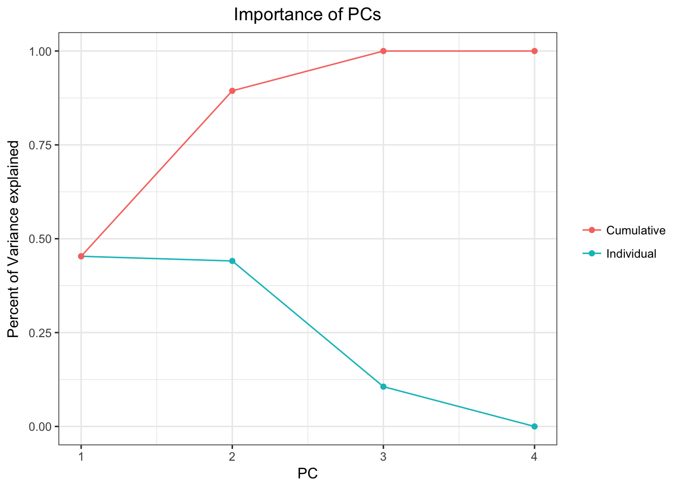 Beautiful!
Visualizing samples on PC plots
What I want is a function that will be generalizable to any number of PC pairs I desire. In the code my lab used, PC plots were done by hand up to 3 plots. It was a rather tedious process to add an extra one, so I want generalizability. For that, I quite like GGally::ggpairs. First of all let’s visualize the output of prcomp$x
pcaDF <- as_data_frame(pca$x, rownames = "Sample")

pcaDF
## # A tibble: 4 x 5
##   Sample                         PC1    PC2    PC3      PC4
##   <chr>                        <dbl>  <dbl>  <dbl>    <dbl>
## 1 SUM159.shNLGN4X.1_DOX.minus  -66.4   42.0 -53.9  5.80e-13
## 2 SUM159.shNLGN4X.1_DOX.plus   124.    56.9   2.02 5.66e-13
## 3 SUM159.shNLGN4X.2_DOX.minus  -70.5   34.9  53.8  5.39e-13
## 4 SUM159.shNLGN4X.2_DOX.plus    13.3 -134.   -2.00 5.52e-13
This is exactly what I need! Go prcomp! All I have to do now is tell ggrid to plot these in a grid. I’ll just do the bottom half of the grid and I may use the top half for correlation plots in the future. This is also where I get the freedom to include as many PCs as I want and to color by sample
numberOfPCs <- 3
pcaPlot <-
  GGally::ggpairs(
  data = pcaDF,
  columns = 1:numberOfPCs + 1,
  mapping = aes(col = Sample),
  upper = NULL,
  legend = c(1, 1)
  ) +
  theme_bw() +
  labs(title = "Principal Components") +
  theme(plot.title = element_text(hjust = 0.5), legend.text = element_text(size = 4))

pcaPlot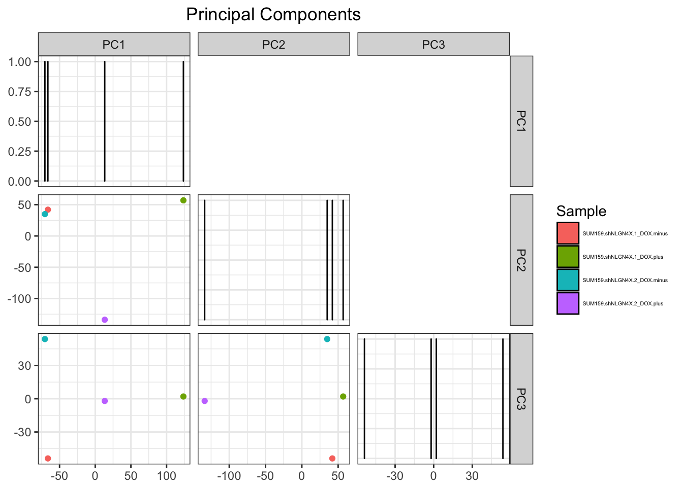
Gorgeous! Let’s put it all together into a function that returns a list with both plots
samplePCA<-function(expressionMatrix, numberOfPCs = 2){

  pca <- stats::prcomp(t(expressionMatrix), center = TRUE, scale = TRUE)

  pcaImportanceDF <-
    pca %>%
    broom::tidy(matrix = "pcs") %>%
    dplyr::rename(., Individual = percent, Cumulative = cumulative) %>%
    tidyr::gather(key, value, Individual, Cumulative)

  importancePlot <-
    pcaImportanceDF %>%
    ggplot2::ggplot(aes(x = PC, y = value, group = key, color = key)) +
    theme_bw() +
    geom_line() +
    geom_point() +
    labs(title = "Importance of PCs", y = "Percent of Variance explained") +
    theme(plot.title = element_text(hjust = 0.5), legend.title = element_blank())

  pcaDF <- as_data_frame(pca$x, rownames = "Sample")

  pcaPlot <- GGally::ggpairs(
    data = pcaDF,
    columns = 1:numberOfPCs + 1,
    mapping = aes(colour = Sample),
    upper = NULL,
    legend = c(2,1)) +
    theme_bw() +
    labs(title = "Principal Components") +
    theme(plot.title = element_text(hjust = 0.5), legend.text = element_text(size = 4))

  returnList<-list(importancePlot = importancePlot, pcaPlot = pcaPlot)
  return(returnList)
}
Let’s test it on the airway dataset
data(airway)
airwayMatrix <- assay(airway)
airwayMatrix <- airwayMatrix[which(apply(t(airwayMatrix), 2, var)!=0), ] # Remove all variance 0 values so PCA doesn't give us an error
airwayPCAPlots <- samplePCA(airwayMatrix)
airwayPCAPlots$importancePlot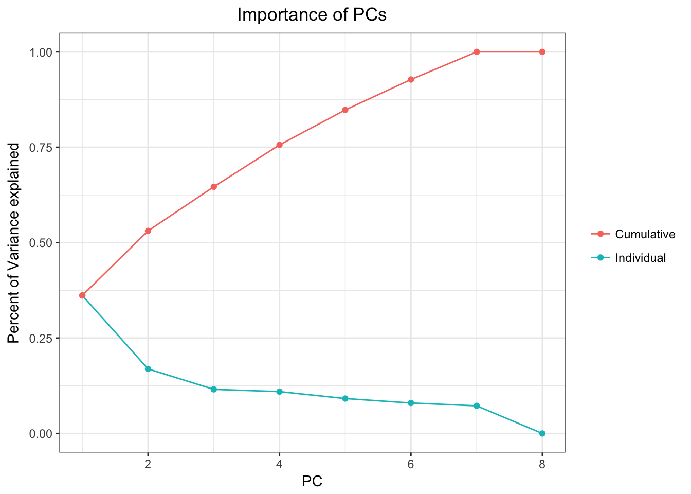
airwayPCAPlots$pcaPlot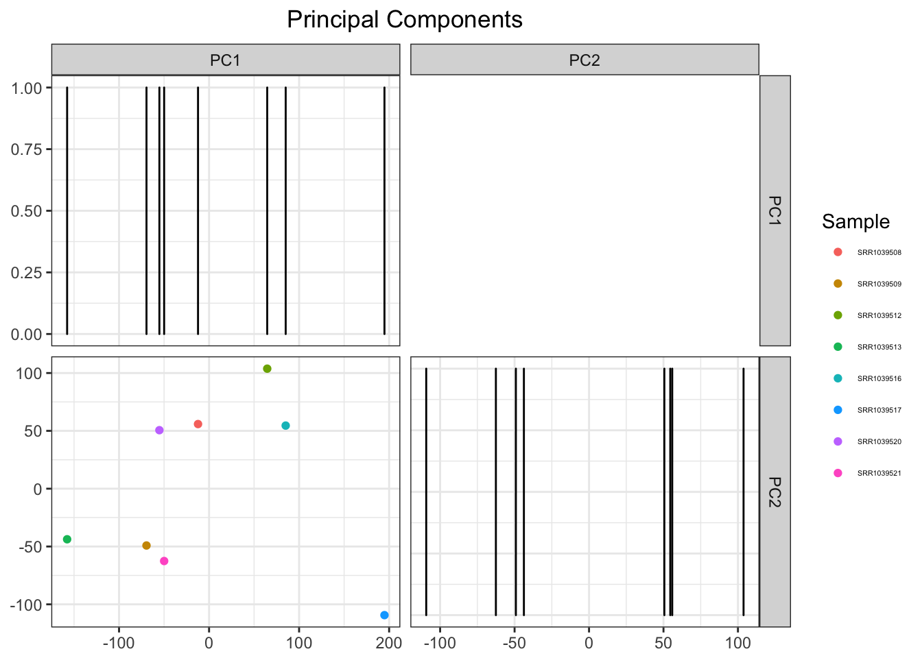
At this point I’m pretty happy with the results. However, why not add an extra couple lines that will allow me to do some clustering while we’re at it.
Addition of clustering feature
Let’s add an extra argument to the function and use factoextra’s eclust
samplePCA <- function(expressionMatrix, numberOfPCs = 2, clusters = 0, autoClustering = FALSE){

  # Rest of the code remains the same up to the declaration of pcaDF
  if (autoClustering) {
    clusterNumber <- NULL
  } else{
    clusterNumber = 0
  }

  #Rest of the program here
}
By doing this, if the user determines they want auto clustering, eclust will find the optimal number for us. Let’s keep going.
# Case 1: If either the user specifies a number of clusters or automatic clustering, then
# this part of code is triggered
if (clusters != 1 || autoClustering) {
  # Using factoextra's eclust to find clusters
  pdf(NULL)
  # This is just to suppress the graphical output for the moment, but we wanna save this plot later
  eclustering <- factoextra::eclust(
    t(expressionMatrix),
    FUNcluster = "kmeans",
    k = clusterNumber,
    k.max = min(10, nrow(t(expressionMatrix))-1)
  )
  dev.off()

  # Join the dataframe with the clustering information as a tibble
  pcaDF <-
    pcaDF %>%
    dplyr::right_join(dplyr::data_frame(
      Sample = names(eclustering$cluster),
      Cluster = LETTERS[eclustering$cluster]
    ))
  # Notice I converted the clusters to letters instead of numbers.
  # ggpairs can deal with this categorical data much better.
  # Factors could also have been used but meh /shrug

  # Generating the grid plot with clusters for colors and samples for shapes

  # This part is added because ggpairs allows up to 6 different shapes
  # Maybe in the future they'll implement a feature to increment them
  # Any more than that and the data points will disappear!
  # In such a case, we flip the shape and cluster parameters

  if (ncol(expressionMatrix)>6){
    graphingParameters <- list(mapping = aes(shape = Cluster, col = Sample))
  } else{
    graphingParameters <- list(mapping = aes(col = Cluster, shape = Sample))
  }
}


else { # Case 2: User wants no clustering
  if(colorByCluster){
    graphingParameters <- list(mapping = aes(col = Cluster)) # If the user prefers to color clusters
  } else{
    graphingParameters <- list(mapping = aes(col = Sample))
  }
}
Bunch of nested if’s, I know. I unfortunately don’t yet know a better way to do this. The logic is quite simple, however:
We first check whether the user wants to cluster or not. If the user does not want to cluster, then they have the choice to color by cluster or sample. In the future I will make this a single argument (
colorBythat allows for those options, but I don’t know how to do that right now).In case the user wants clustering, the one other check is done is the number of samples. If there are too many of them (>6), ggpairs won’t allow that many shapes, so in that case we trade shapes and colors (samples and clusters). I hope something native for ggpairs is implemented in the future.
That practically completes the picture! All we’re missing is making the actual remaining plots with the remaining graphical parameters
graphingParameters <- c(
  graphingParameters, # aes() parameters from the nested if's
  list(
    data = pcaDF,
    columns = 1:numberOfPCs + 2,
    lower = list(continuous = GGally::wrap("points", size = 3)),
    upper = NULL,
    legend = c(2,1)
  )
)

pcaPlot <- do.call(GGally::ggpairs, graphingParameters) # Generate the plot with these parameters

# Add a few details:
pcaPlot <-
  pcaPlot +
  theme_bw() +
  labs(title = "Principal Components") +
  theme(plot.title = element_text(hjust = 0.5))

# We also customize the clustering plot from eclust a little bit:
clusteringPlot <-
  eclustering$clust_plot +
  theme_bw() +
  theme(plot.title = element_text(hjust = 0.5))

# And return them to the user!
returnList<-list(importancePlot = importancePlot, pcaPlot = pcaPlot, clusteringPlot = clusteringPlot)
return(returnList)
And that completes the function! In one block and following tidyverse style guides it looks like:
Let’s test it out on the airway dataset. First, no autoclustering and user-defined 2 clusters
airwayPCAPlots <- samplePCA(airwayMatrix, numberOfPCs = 3, clusters = 2, autoClustering = FALSE)
## Joining, by = "Sample"
airwayPCAPlots$pcaPlot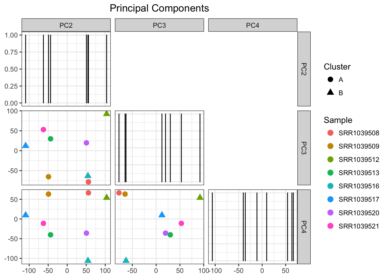
airwayPCAPlots$clusteringPlot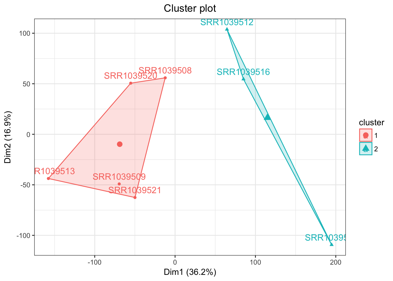
Beautiful! Next let’s see the autoclustering
airwayPCAPlots <- samplePCA(airwayMatrix, numberOfPCs = 3, autoClustering = TRUE)
## Joining, by = "Sample"
airwayPCAPlots$pcaPlot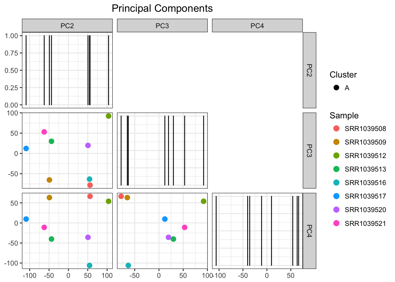
airwayPCAPlots$clusteringPlot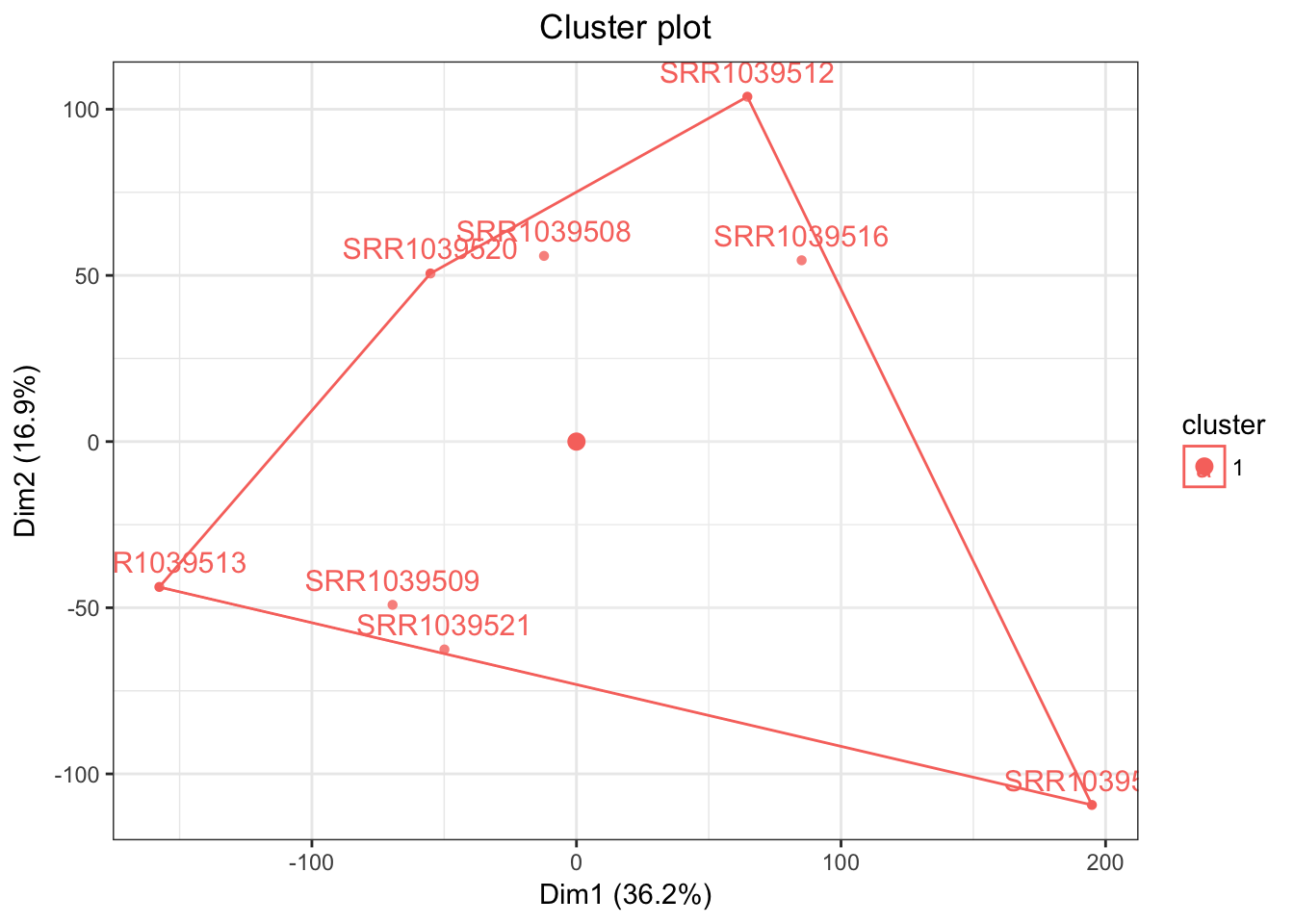
And a beautiful plot we get indeed! Of couse this algorithm would be more useful for larger data sets, which is a topic for another day! For now, have a sneak peak at what it can do with a large enough data set (METABRIC breast cancer)
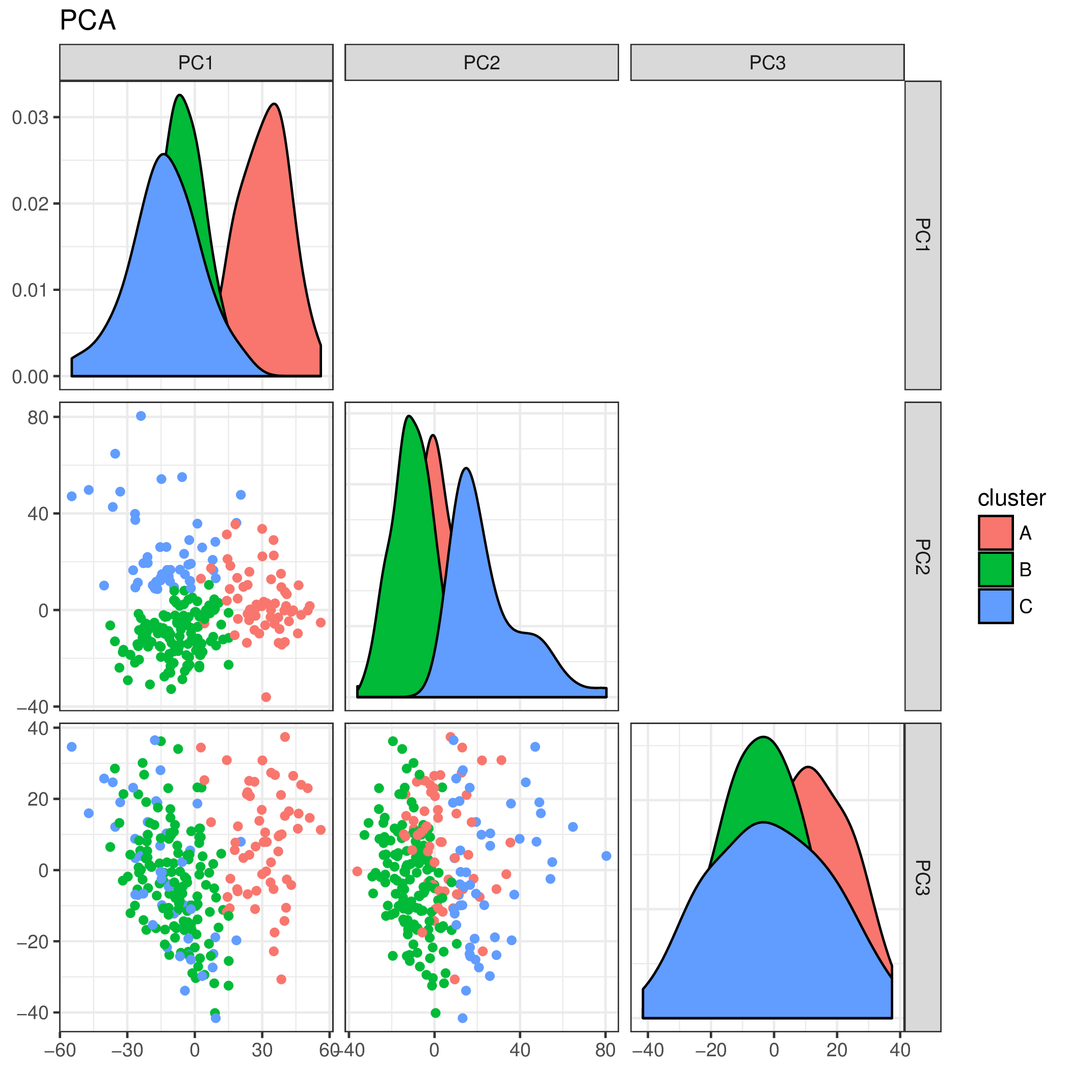
PCA plot for the subset of Triple Negative tumors in the METABRIC dataset
Closing thoughts
My motivation for writing this function is that it will be implemented in a future project (Shiny web app!), so it needs to generalize to all sorts of inputs. Pretty happy with my progress starting this blog! My apologies for how long it got. But hey, it’s quite functional!

Twitter
Google+
Facebook
Reddit
LinkedIn
StumbleUpon
Pinterest
Email