How’s it going everyone?! Well, I decided to join Thomas Mock’s #TidyTuesday on twitter and this is my second submission. I’ll write a second post on my first submission because that took a little longer to figure out. Anyway let’s get going! First, let’s import the necessary packages
library(tidyverse)
library(rjson)
colors <- fromJSON(file = "~/Code/tidy_tuesday/Week_3/colors.json")
Rjson is only needed for my color palette, which I created as a JSON from here. I also imported my color palette as the vector named colors. Next, since I want to be able to produce as many as these plots as I want, I created a function that would let me avoid redundance. The function first checks whether we’re computing for the entire world or just a country, then does the necessary tidying up and plotting. Of course, in order to create the function I first explored the dataset. This is just the finalized product.
plotting_function <-
  function(
    data,
    yearOfInterest,
    countryName,
    title = paste("Share of death by cause, ", countryName, ", ", yearOfInterest, sep = ""),
    subtitle = "",
    caption = "Source: IHME, Global Burden of Disease"
  ){
    if (countryName == "World") {
      data <- data %>%
        filter(year == yearOfInterest) %>%
        select(-c(country, country_code, year)) %>%
        summarize_all(funs("sum"))
    } else {
      data <- data %>%
        filter(year == yearOfInterest, country == countryName) %>%
        select(-c(country, country_code, year))
    }
    data %>%
      gather(key = "disease", value = "deaths") %>%
      mutate(deaths = deaths / sum(deaths)) %>%
      ggplot(aes(x = reorder(disease, deaths), y = deaths, fill = disease))+
      geom_bar(stat = "identity")+
      geom_text(aes(label = paste(round(100 * deaths, 2), "%")), hjust = -0.1)+
      scale_y_continuous(labels = scales::percent, limits = c(0, 0.35))+
      scale_fill_manual(values = colors)+
      guides(fill = FALSE)+
      coord_flip()+
      xlab("")+
      ylab("")+
      theme_classic()+
      labs(title = title, subtitle = subtitle, caption = caption)+
      theme(
        panel.grid.major.x = element_line(linetype = "dotted", color = "#5043484A")
      )
  }
So let’s try it out on the dataset! First we import the data with readxl and use stringr to remove the percentage signs from the variable names. I also decided to omit NA’s, which I think is why my numbers are slightly different from those in the article. Oh well shrug
data <- readxl::read_xlsx("~/Code/tidy_tuesday/Week_3/global_mortality.xlsx") %>%
  rename_all(funs(stringr::str_remove_all(., "[(%)]"))) %>%
  na.omit()
data
## # A tibble: 4,524 x 35
##    country country_code  year `Cardiovascular… `Cancers ` `Respiratory di…
##    <chr>   <chr>        <dbl>            <dbl>      <dbl>            <dbl>
##  1 Afghan… AFG           1990             17.6       4.03             2.11
##  2 Afghan… AFG           1991             17.8       4.05             2.13
##  3 Afghan… AFG           1992             18.4       4.17             2.21
##  4 Afghan… AFG           1994             19.1       4.26             2.31
##  5 Afghan… AFG           1995             19.9       4.39             2.41
##  6 Afghan… AFG           1996             20.4       4.48             2.49
##  7 Afghan… AFG           1997             20.4       4.45             2.49
##  8 Afghan… AFG           1998             19.6       4.26             2.41
##  9 Afghan… AFG           1999             21.1       4.57             2.60
## 10 Afghan… AFG           2000             21.4       4.64             2.64
## # … with 4,514 more rows, and 29 more variables: `Diabetes ` <dbl>,
## #   `Dementia ` <dbl>, `Lower respiratory infections ` <dbl>, `Neonatal
## #   deaths ` <dbl>, `Diarrheal diseases ` <dbl>, `Road accidents ` <dbl>,
## #   `Liver disease ` <dbl>, `Tuberculosis ` <dbl>, `Kidney disease
## #   ` <dbl>, `Digestive diseases ` <dbl>, `HIV/AIDS ` <dbl>, `Suicide
## #   ` <dbl>, `Malaria ` <dbl>, `Homicide ` <dbl>, `Nutritional
## #   deficiencies ` <dbl>, `Meningitis ` <dbl>, `Protein-energy
## #   malnutrition ` <dbl>, `Drowning ` <dbl>, `Maternal deaths ` <dbl>,
## #   `Parkinson disease ` <dbl>, `Alcohol disorders ` <dbl>, `Intestinal
## #   infectious diseases ` <dbl>, `Drug disorders ` <dbl>, `Hepatitis
## #   ` <dbl>, `Fire ` <dbl>, `Heat-related hot and cold exposure ` <dbl>,
## #   `Natural disasters ` <dbl>, `Conflict ` <dbl>, `Terrorism ` <dbl>
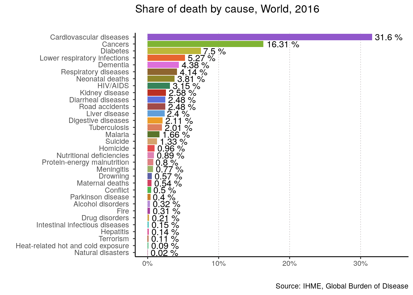
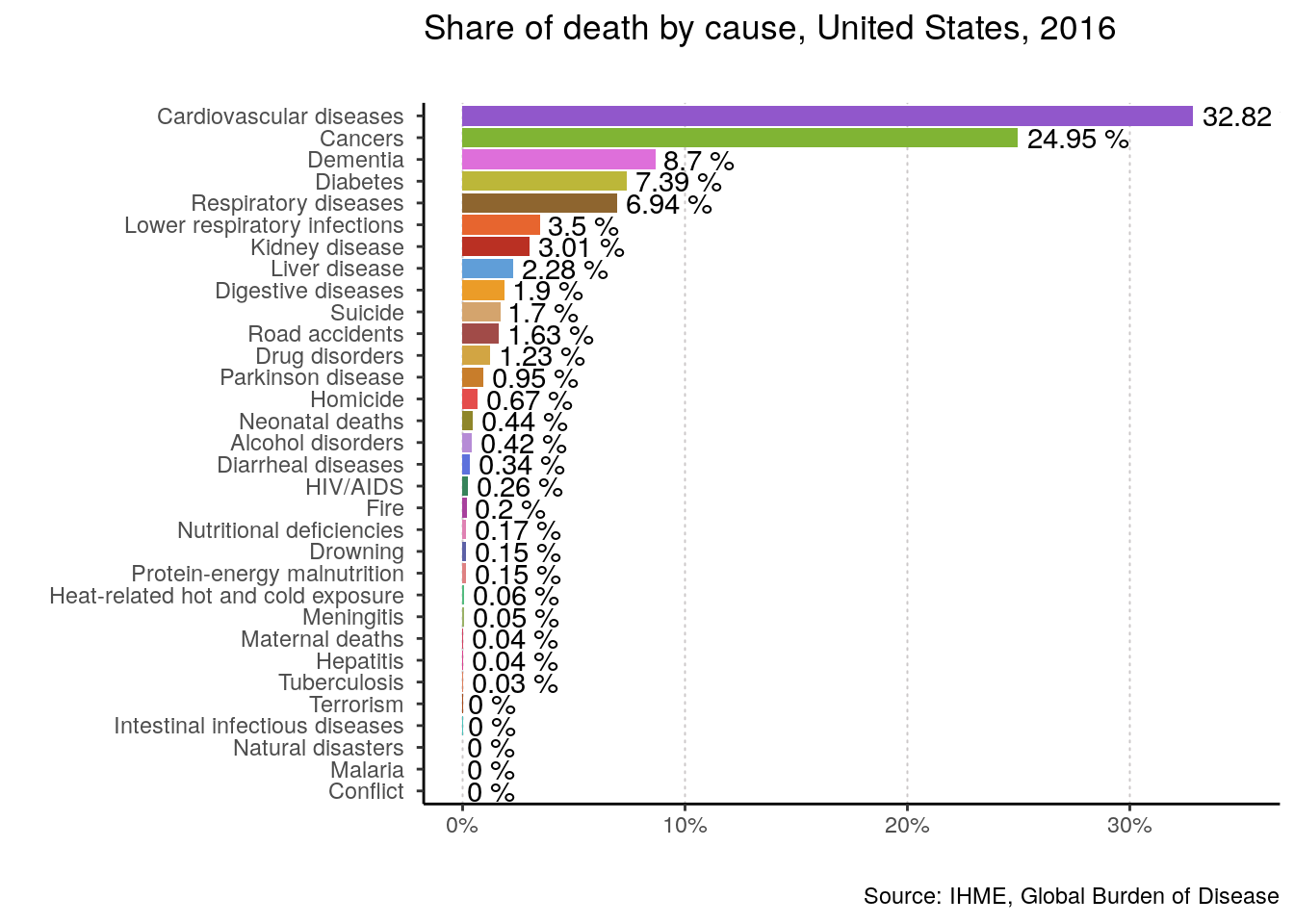
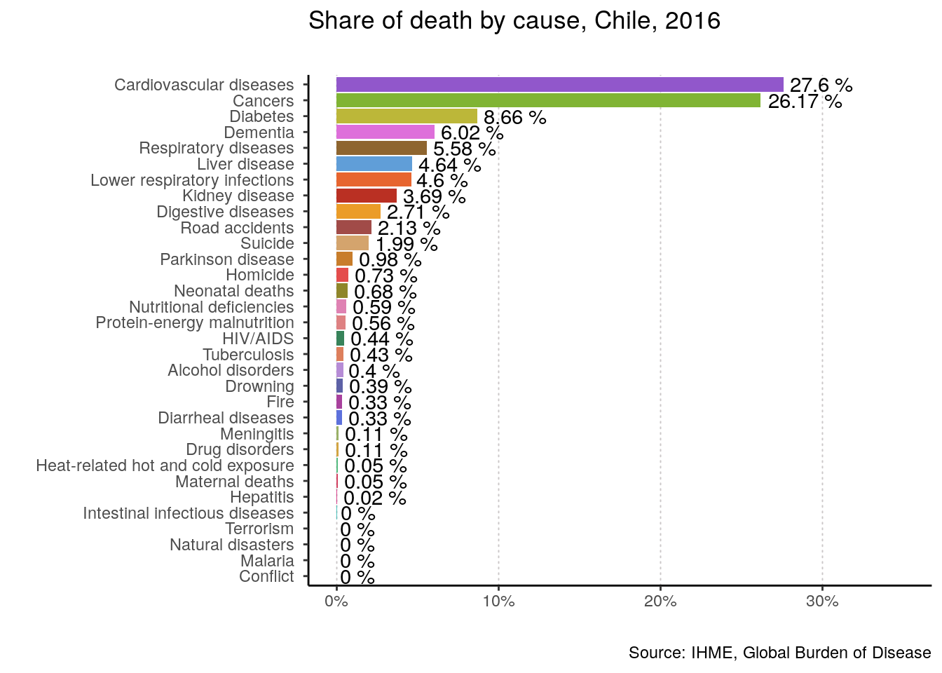
Finally, let’s use the function on the world, the US, and my beloved Chile for 2016.
plotting_function(data = data, yearOfInterest = 2016, countryName = "World")
plotting_function(data = data, yearOfInterest = 2016, countryName = "United States")
plotting_function(data = data, yearOfInterest = 2016, countryName = "Chile")
Nice! Of course, we could input any country and year and get the same kind of plot. That’s all friends!

Twitter
Google+
Facebook
Reddit
LinkedIn
StumbleUpon
Pinterest
Email